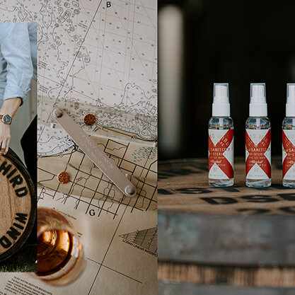
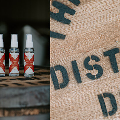
|||| BRANDING:THIRD WIND DISTILLING HAND SANITIZER PACKAGING ||||
_THIRD WIND DISTILLING PACKAGING: EXPECTING THE UNEXPECTED
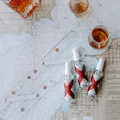
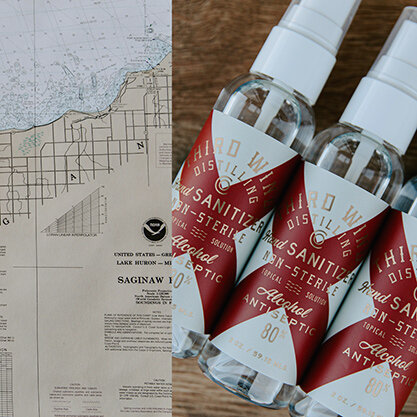
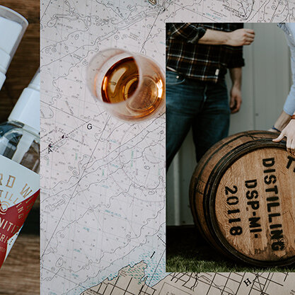
When the folks at Third Wind Distilling Co. originally reached out to discuss collaborating on branding their new distillery we never expected their first batch to be hand sanitizer. However, it showcased the true flexibility of the packaging system we were creating for their spirits. The brand leverages nautical flags as marks of distinction and for their first release being hand sanitzer the letter “V” of the nautical alphabet meaning “in need of assistance” was the perfect answer.
RELATED POST
_WFIQ: MERGE VISUAL IDENTITY + POSTER

TOPIC: BRANDING
We were tasked to create a visual identity and poster for the WFIQ Merge series that would start the conversation and communicate the strategy behind the events.