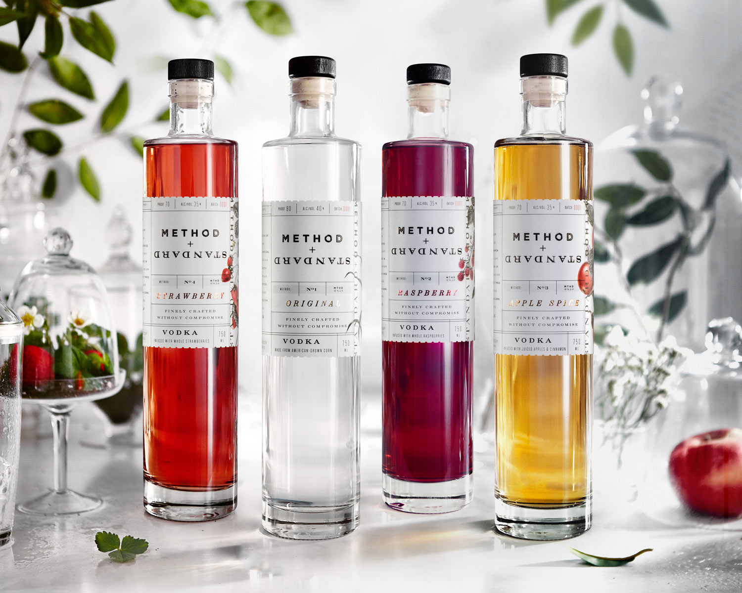
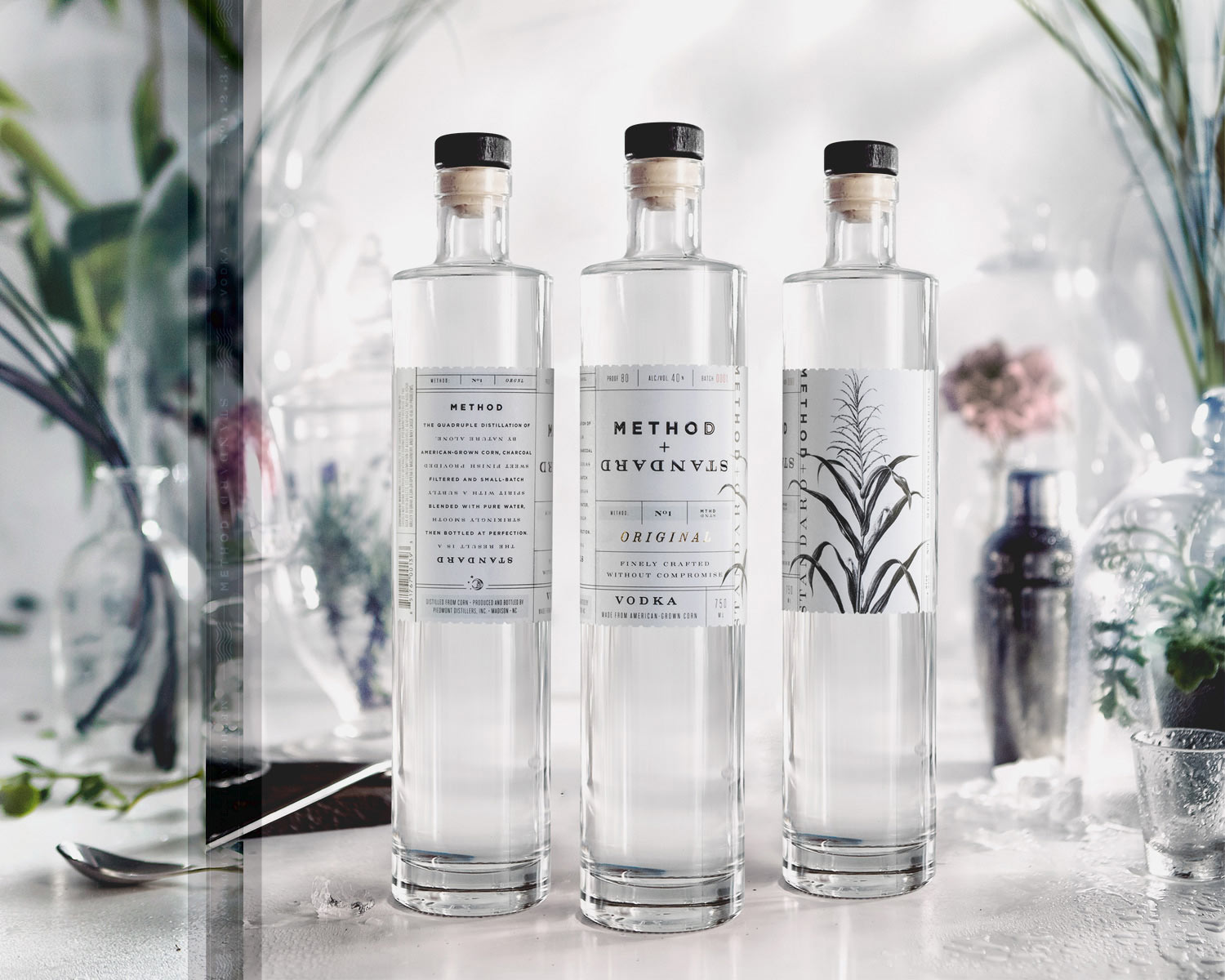
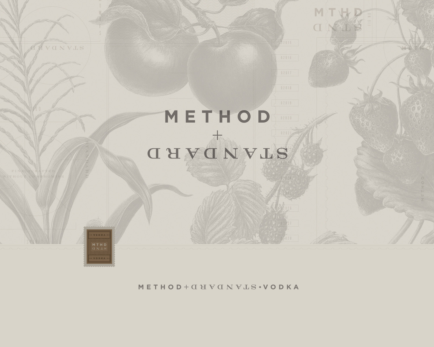
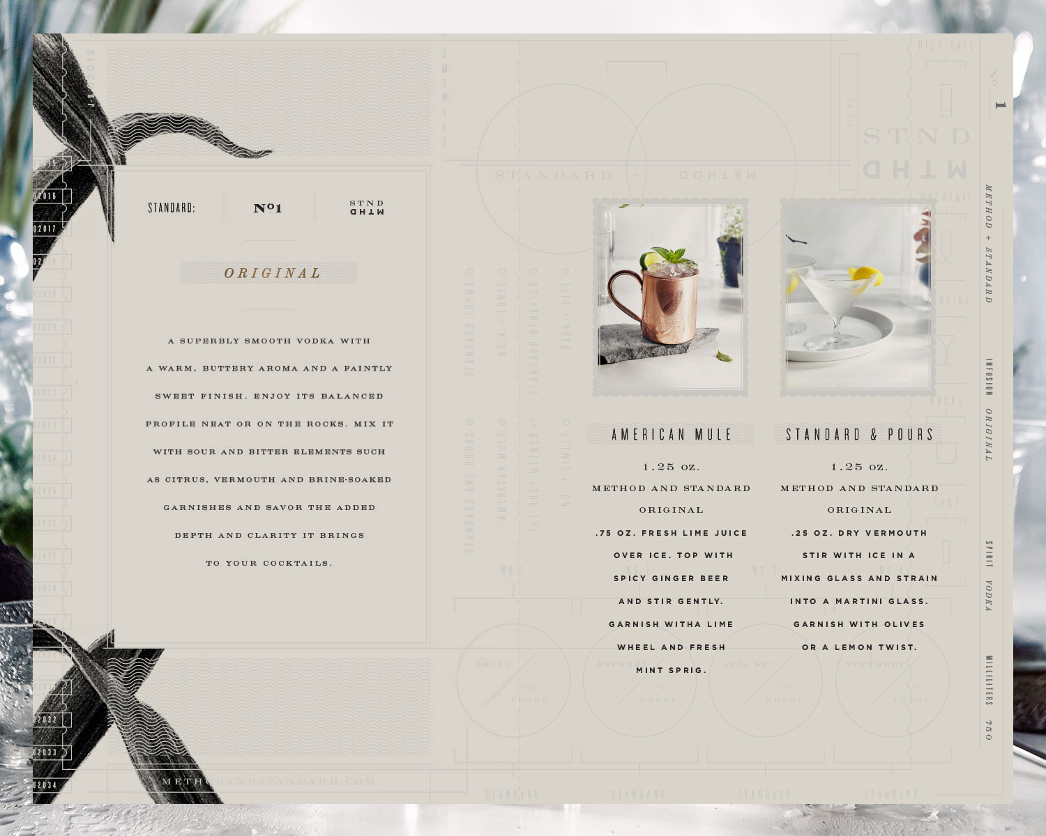
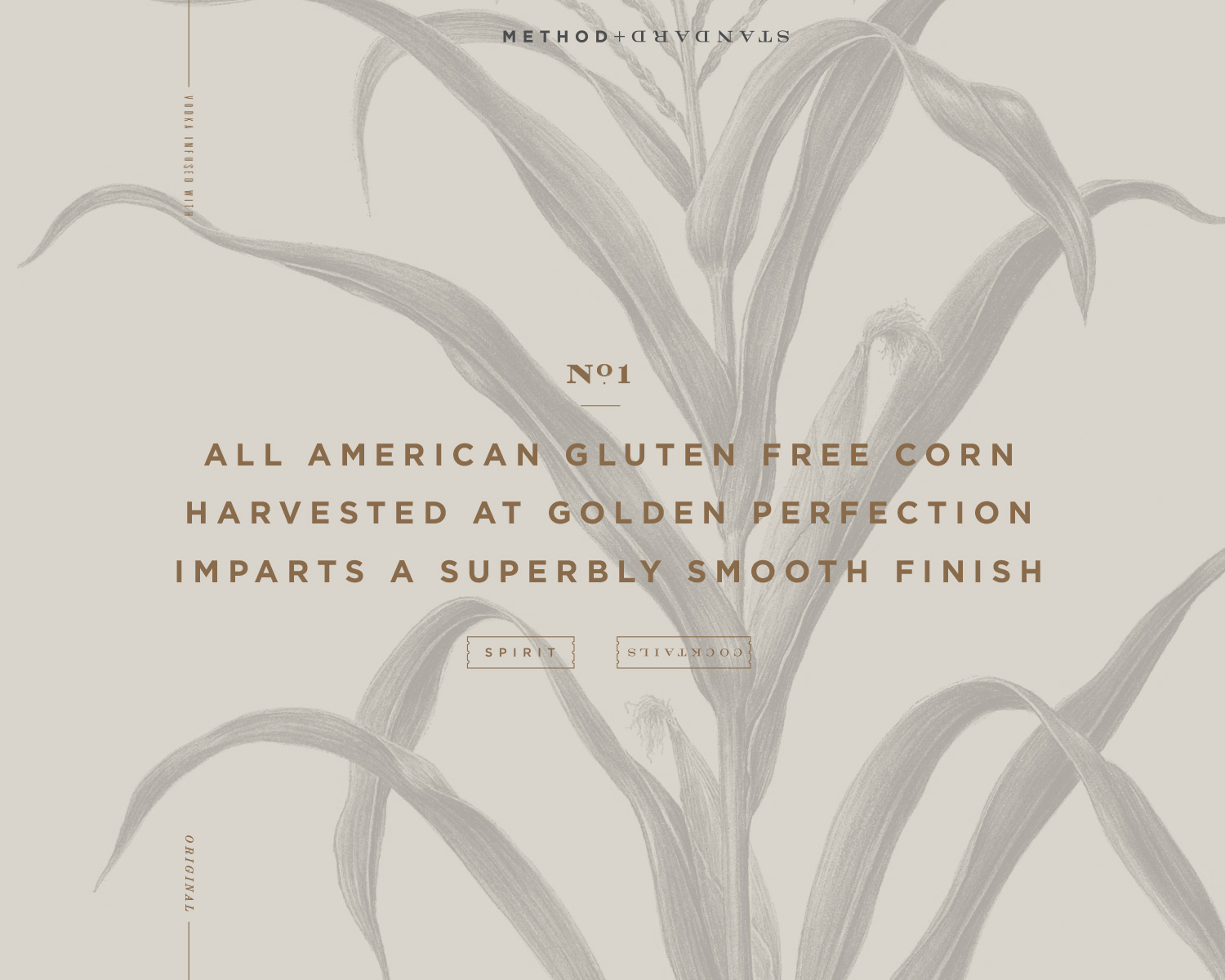
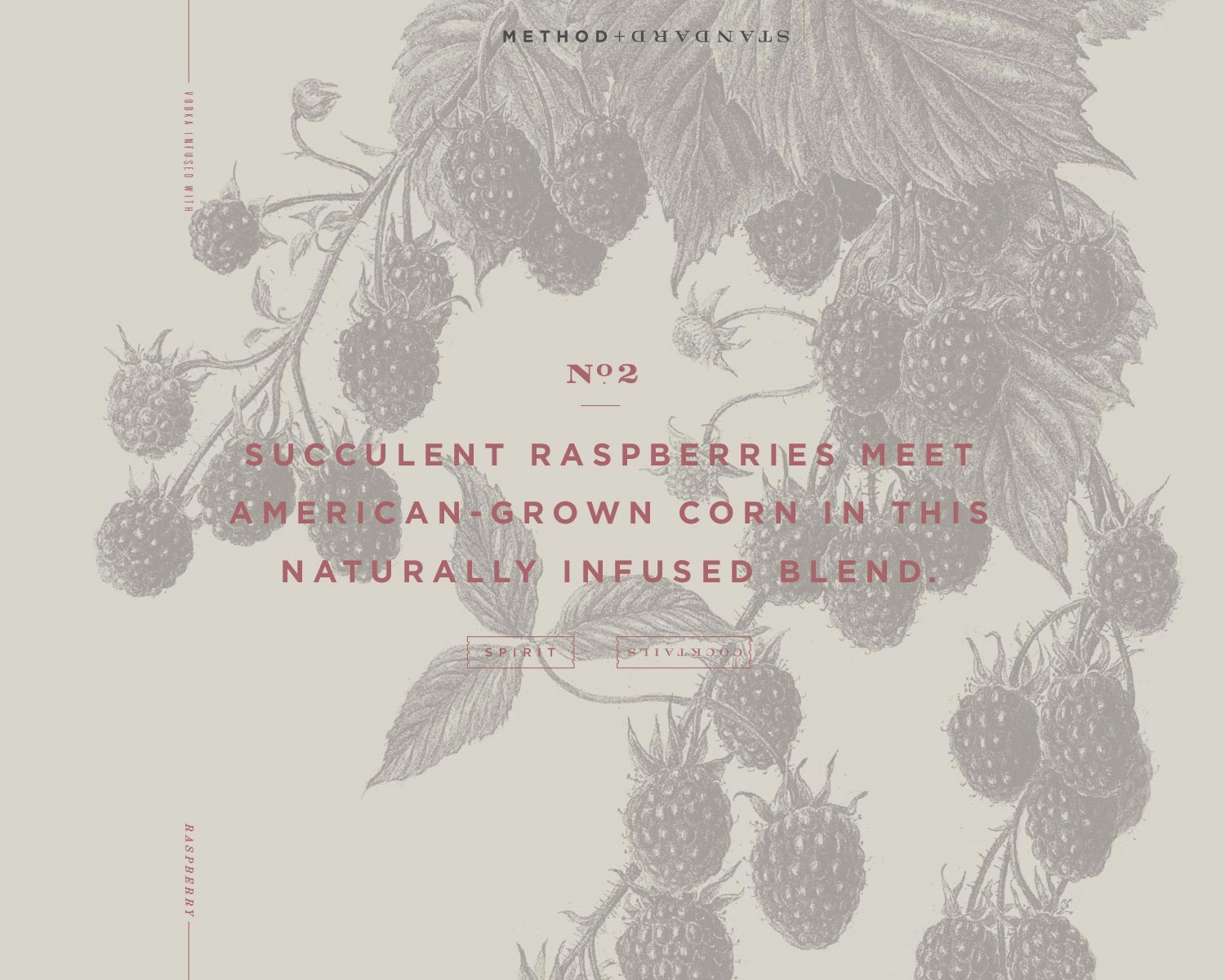
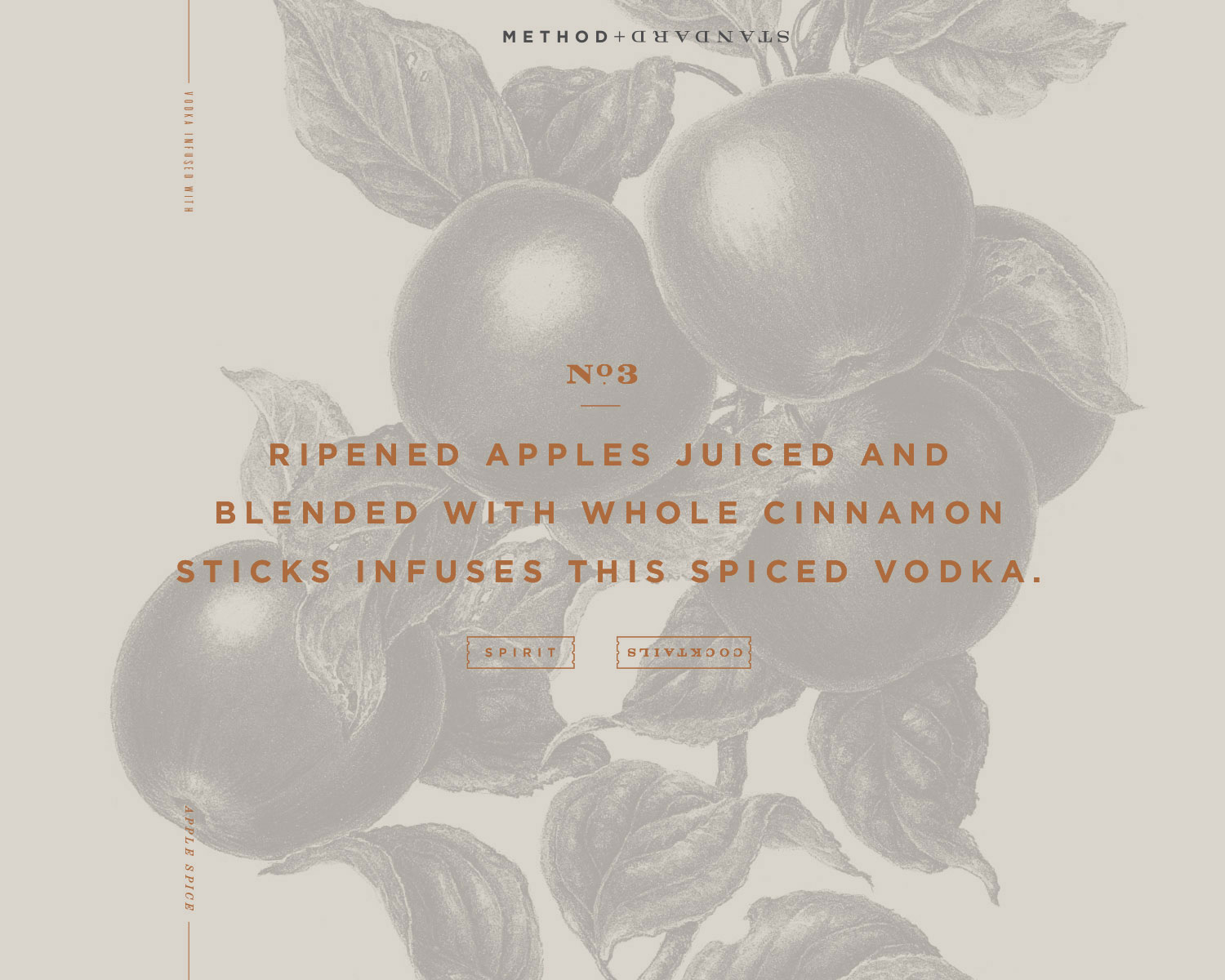
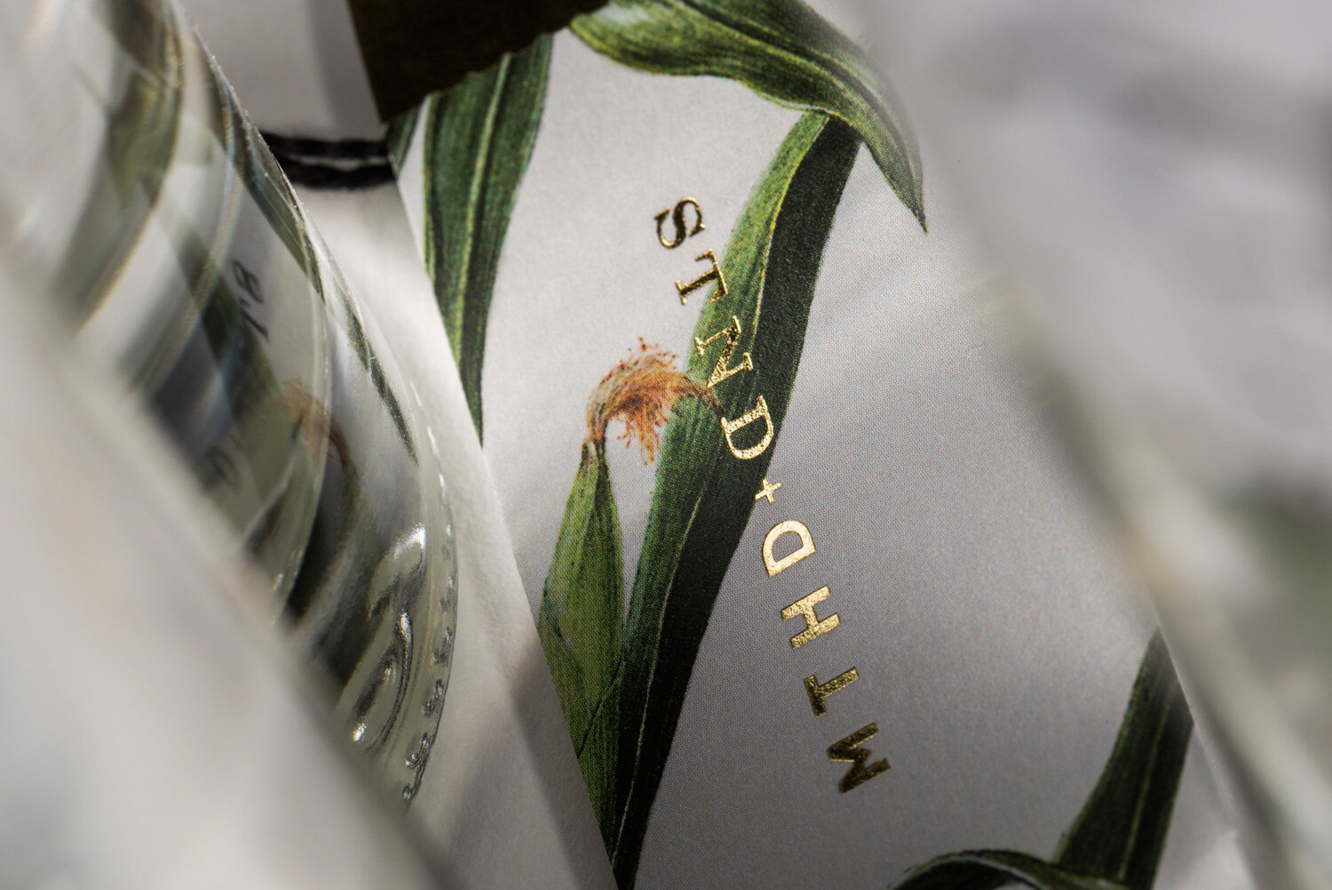
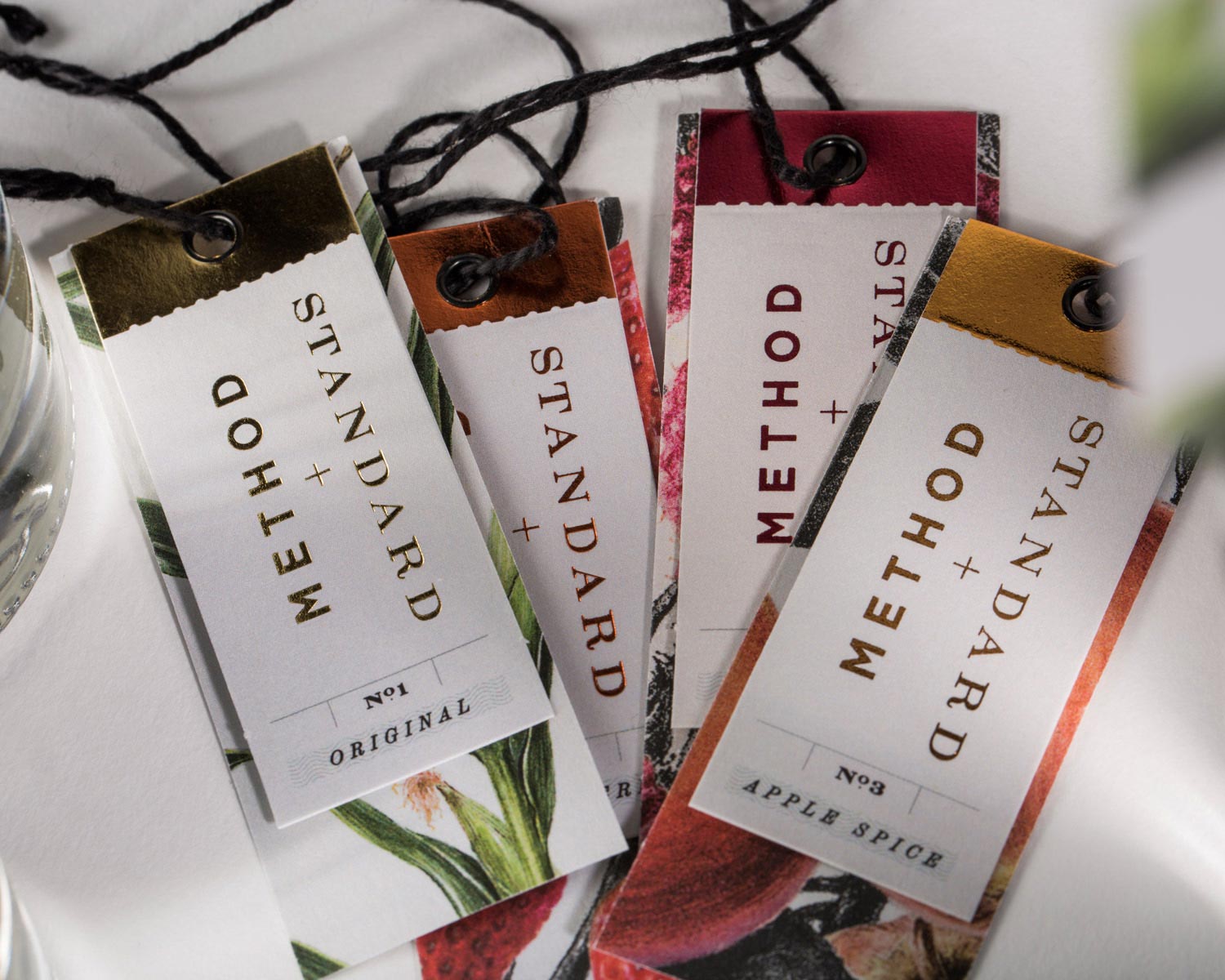
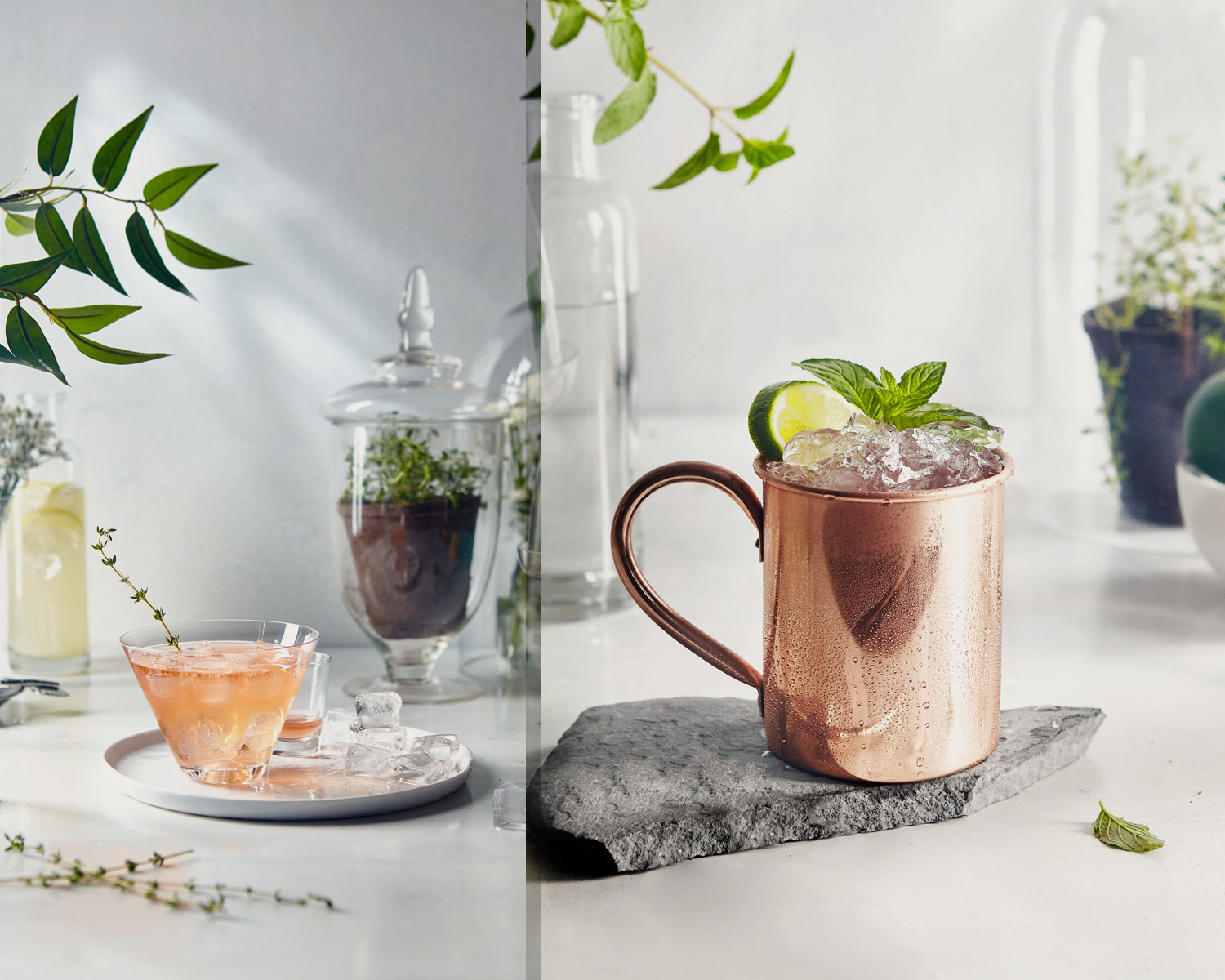
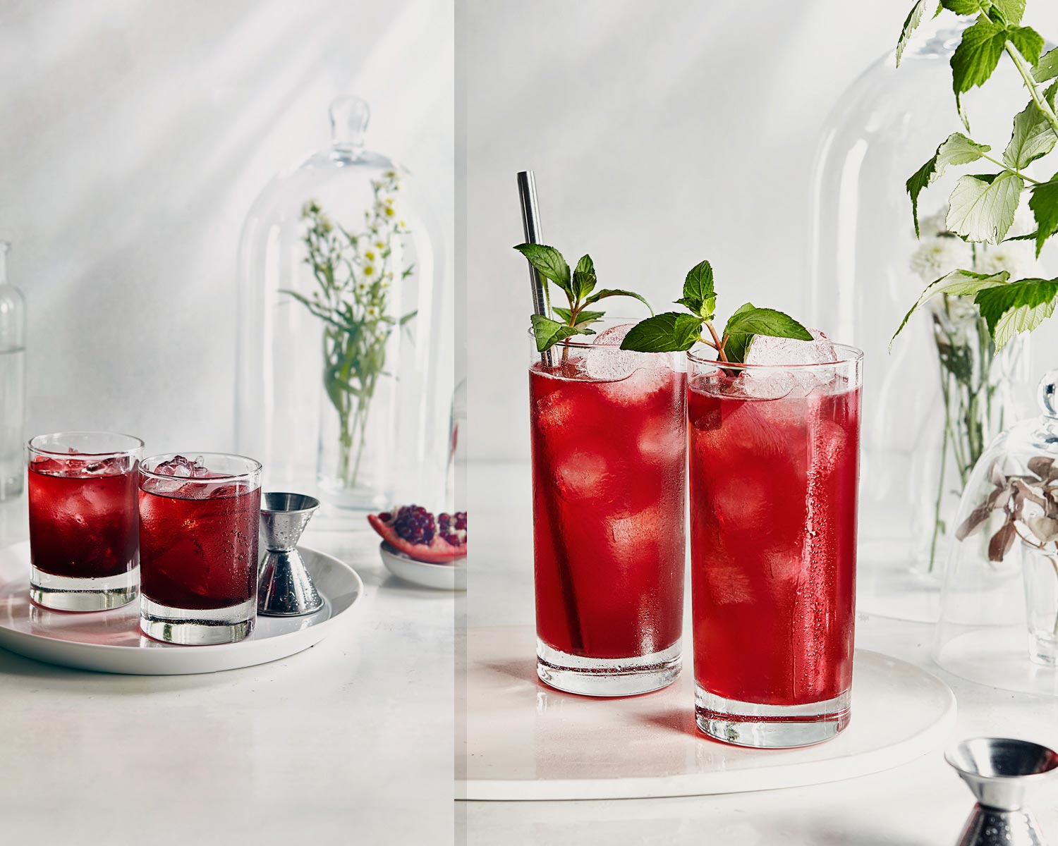
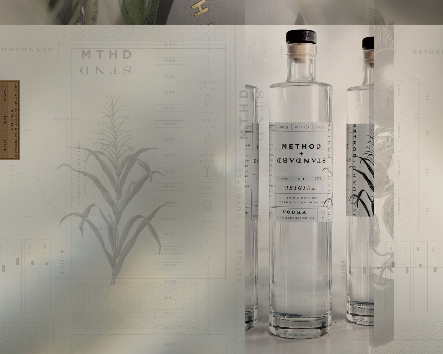
METHOD+STANDARD VODKA BY PIEDMONT DISTILLERS

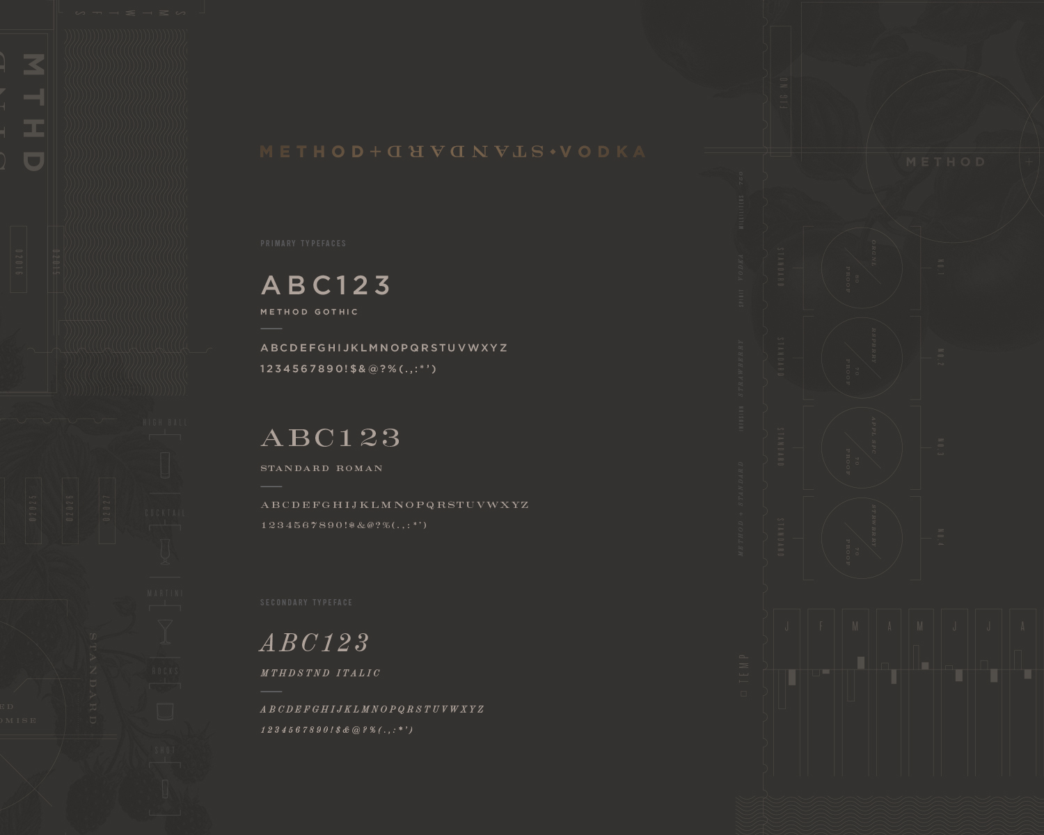
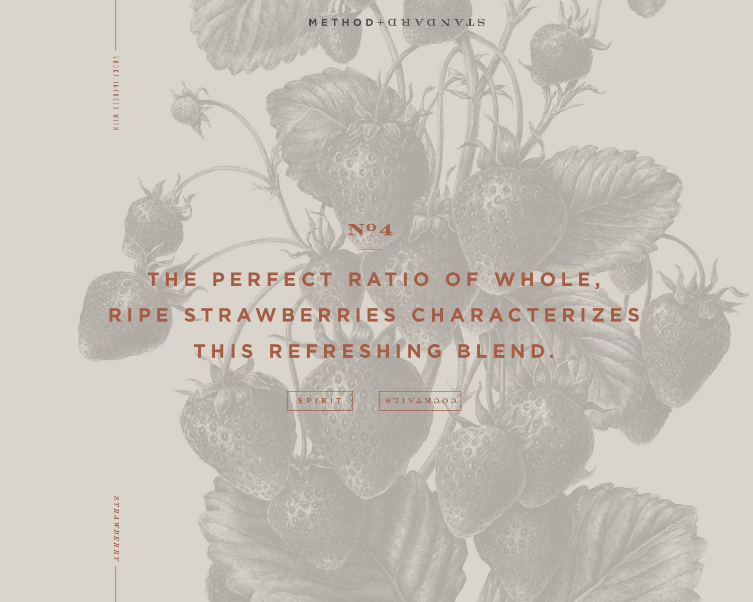
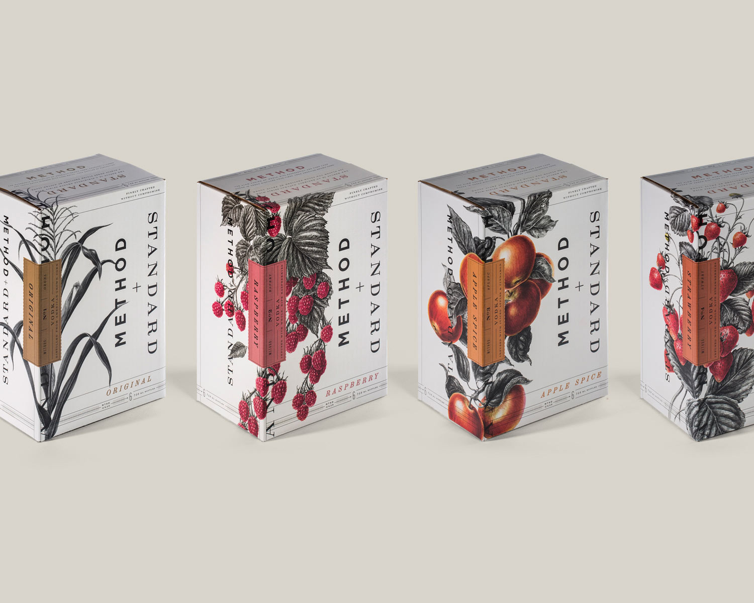
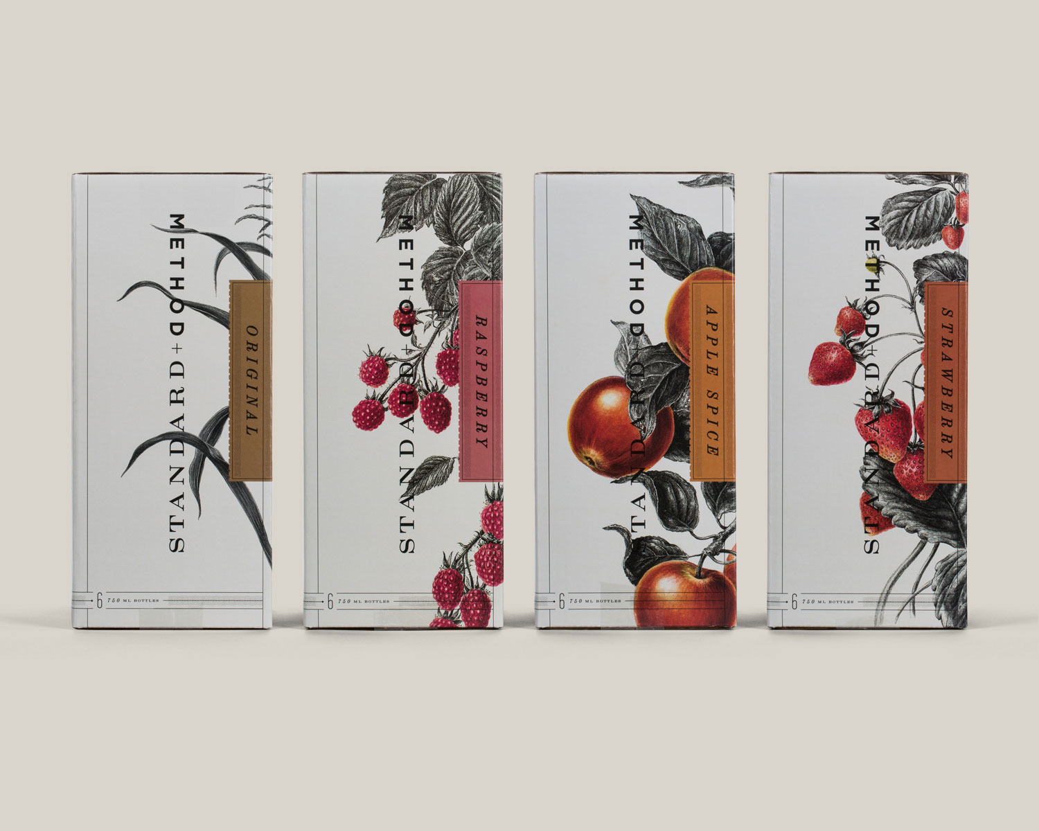
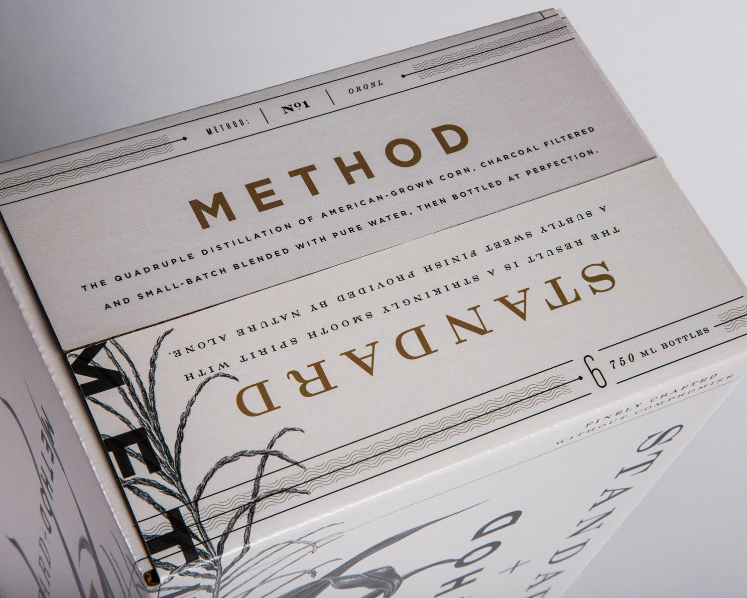
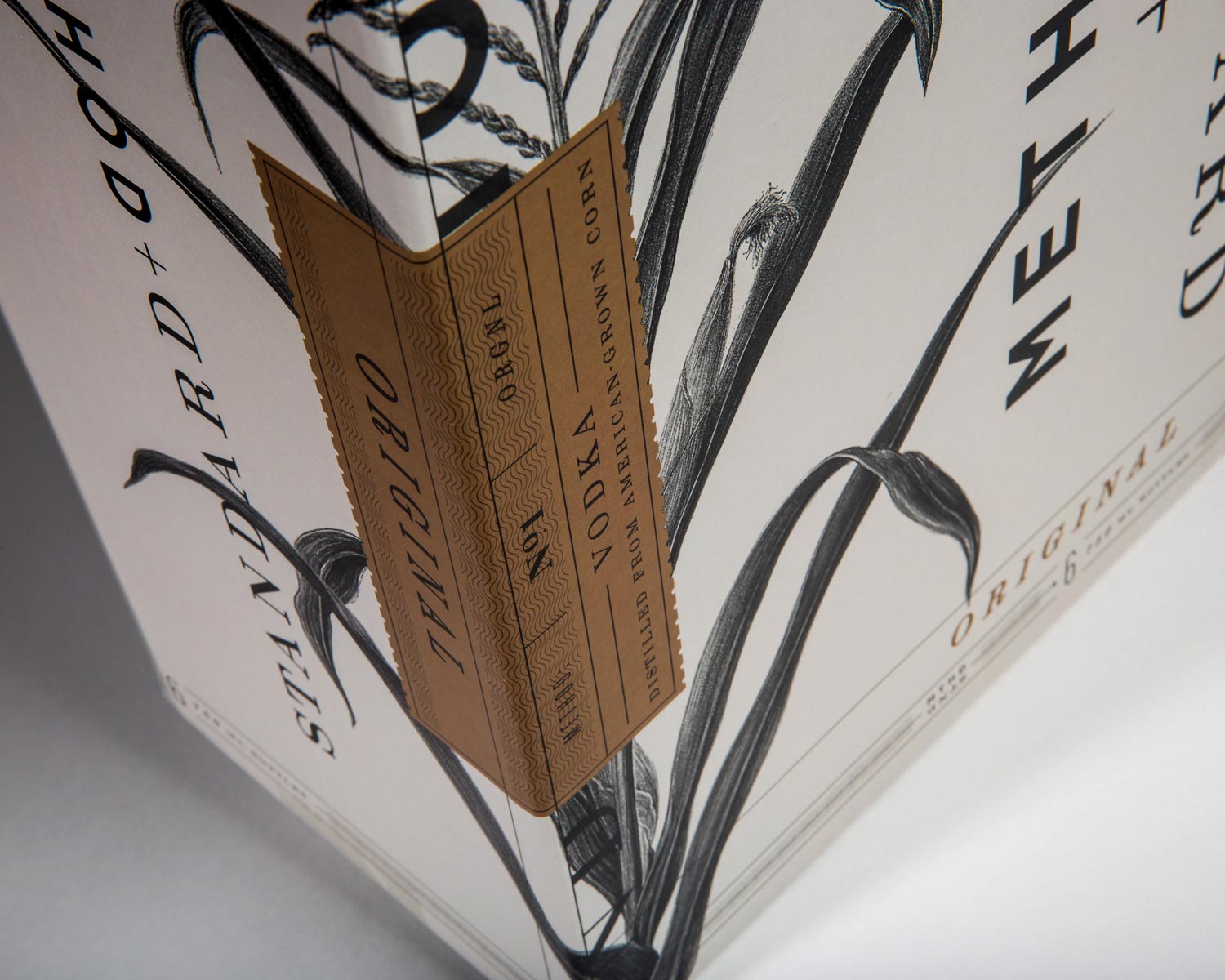
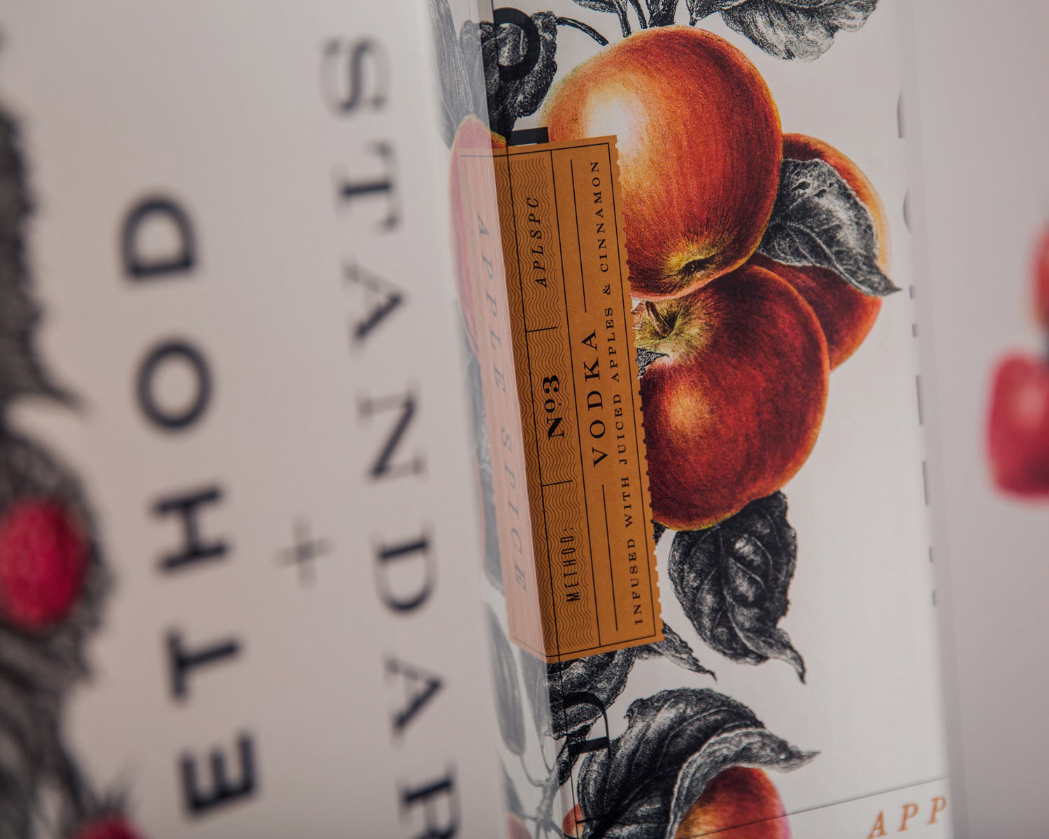
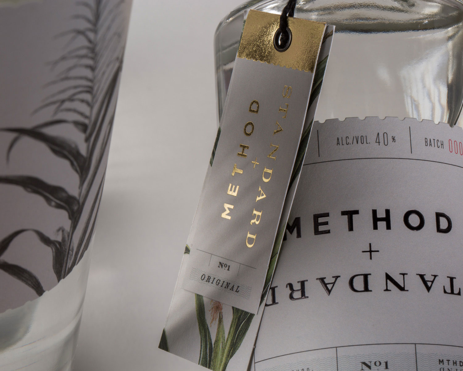
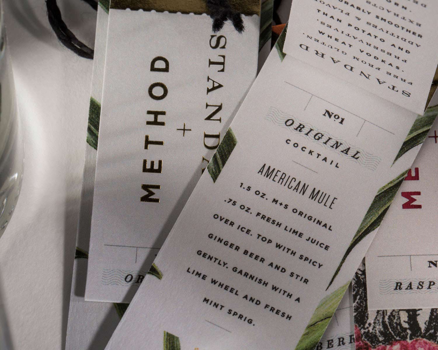
Method + Standard is a vodka for those who care equally about what goes in to the bottle as what comes out of it. This dual-concept approach is embodied in a brand identity as carefully crafted as the vodka itself. 

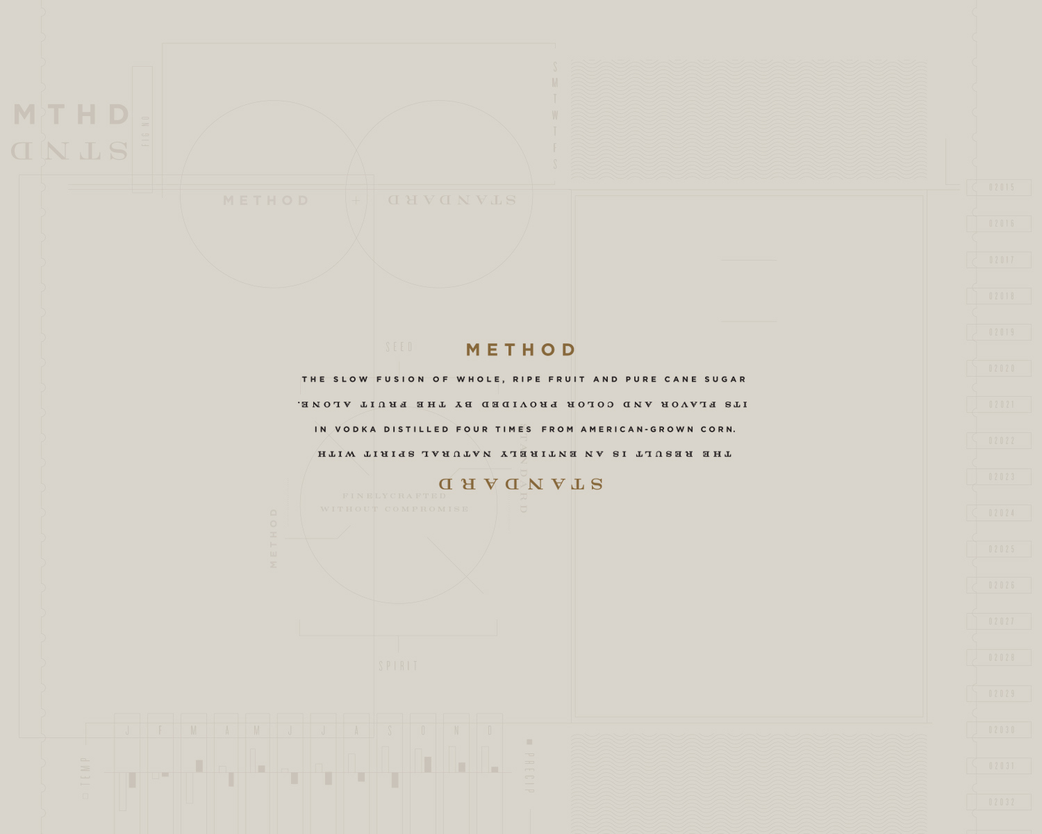
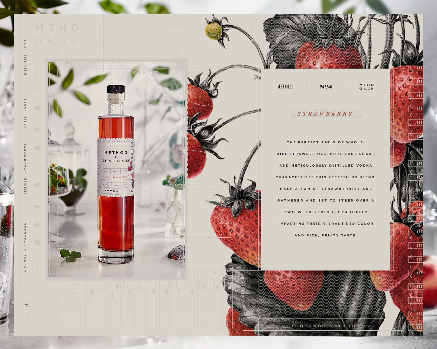
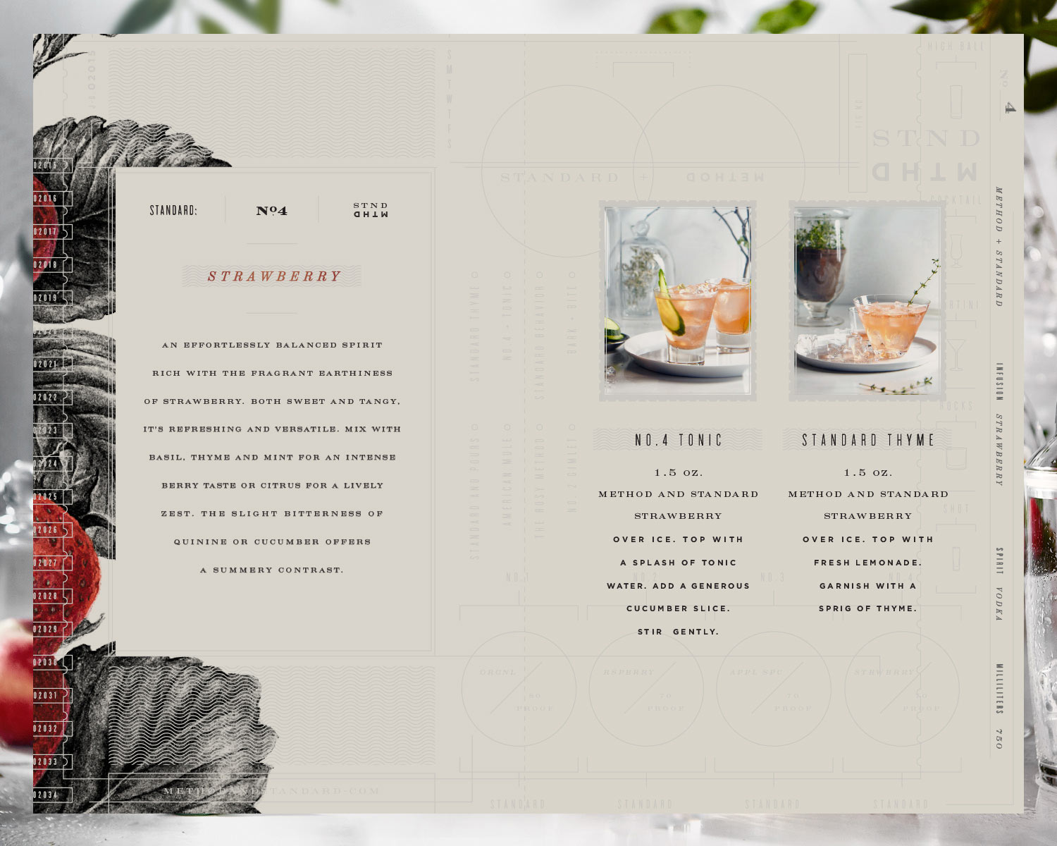
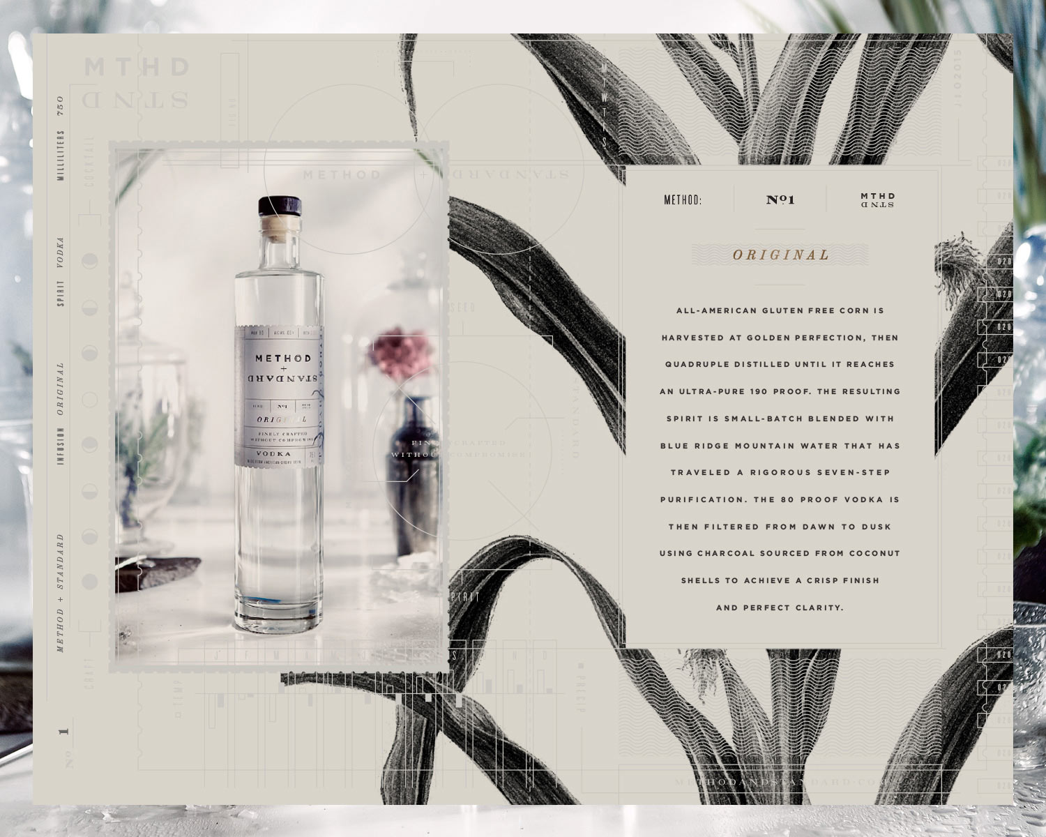
Embracing the spirit’s all-natural, additive-free, small-batch sensibility – following it from the sourcing of its off-the-branch ingredients to the memorable experience of the final pour – each design element underpins the notion that it’s the method that creates the standard, and that the two are inseparably intertwined.


SERVICES

BRAND POSITIONING
BRAND IDENTITY
COLLATERAL
CONTENT CREATION
COPYWRITING
MESSAGING
PACKAGING
PHOTOGRAPHY
PRINT
WEBSITE


We began with a name that juxtaposes the themes of creation and consumption, while the label design with artfully considered text running in both directions offers a differing experience upon both viewing and pouring. 

Unadorned, clear bottles highlight the rich, all-natural hue of the spirit, which takes its color from fruit alone. Sustainable uncoated labels featuring commissioned illustrations of unharvested fruit indicate the brand’s back-to-basics approach, while foil lettering revisits the richness of the fruit infusion. 

Taking it’s cue from the label design, stylish bottle swing-tags incorporate tasting notes and house-created recipes, enticing consumers to experience a boutique spirit that’s proud to be finely crafted - without compromise.


AWARDS & PRESS

GRAPHIS
TYPE DIRECTORS CLUB
COMMUNICATION ARTS EXHIBIT
CA TYPOGRAPHY ANNUAL
PRINT TYPOGRAPHY & LETTERING
PRINT REGIONAL DESIGN ANNUAL
HOW INTERNATIONAL ANNUAL
THE DIELINE